Tuesday, April 21, 2009

fresh ideas.


Things are winding down, with lots to do and little time.

Mercat Santa Caterina was the site to be at this week.... okay well at least for me. History project II and the final sketching class were held at the market. Built by EMBT architects the site was originally a convent back in the roman days and then torn down to make housing and a new market for the growing city. From there the market was refurbished just a few years ago and is now a very lively and dynamic place to visit.


Still talking about edges, I think the market is an interesting place to look at, but at the same time confusing. The market is surrounded by streets on all four sides creating an edge just for the site. Mercat Canta Ceterina is a market on the front side and then in the rear responds to its surrounding community of housing and is several floors of apartments for the elderly. In this essence the architect did not completly abandon what was occuring in the surrounding buildings but rather adapted the program and added his own architectural elements. But of course the most dynamic element and edge is the roof line. The roof line takes on a wavey motion and is covered in different colored bright tiles. The edge that this building creates with the sky is amazing to look at close up and at a distance. The architect allowed the building to no longer be contained to a flat and shapless roof but took on the elements of the interaction spaces below and the fluidly of the sky. So no longer a hard edge (although it physically is) but rather a movement through the sky.

Inside the market is spilling will all kinds of smells from fresh fruit, cheese, nuts, meats, fishes, olives, and vegatables. But if you take a glance at the ceiling the use of wood in this city, to me, is a 'fresh idea' that the architect instituted. The wood planks and lines the curvature of the roof and frames the large doors and windows that allow a good amount of light into the space. I am glad to see that the architect allowed the viewer to experience the roof from the inside as well and not closing off the roof.

Sunday, April 12, 2009

a building fit for a king.


what: the Barcelona Pavilion
by: Ludwig Mies van der Rohe
year: 1929
why: Built as the German national pavilion for the 1929 Barcelona International Exhibition. The Pavilion was conceived to accommodate the official reception presided over by King Alphonso XIII of Spain along with the German authorities.
with: Built from glass, travertine and different kinds of marble
history: After the closure of the Exhibition, the Pavilion was disassembled in 1930. In 1980 Oriol Bohigas headed up the design and supervise the reconstruction of the Pavilion. Work began in 1983 and the new building was opened on its original site in 1986.


okay so I just want to quickly write a little about the spaces created within the walls of the Barcelona Pavilion.

To begin, I truly appreciate the space but at the same time the space also confuses me. Before, during, and after the teachers discussion and description there was so much to look at because of all the precision taken within the placement of each architectural element. So because of all of the elements that there is to look at I am just going to focus on what I like best: the pools of water.

When approaching the first pool of water one approaches it from an oblique angle. The far left corner of the pool is surrounded by a wall that wraps around the corner. This wall helps to create several edges all at one time. 1_ The surface to sky horizon, for all of the walls in the entire pavilion are the same height and it is a height that corresponds the the heavy bottom base of the Palace walls. 2_It helps to create the visual plane at where the 'area' of the pavilion ends. 3_Also the water ends right at the base of the walls and then they begin to extend upwards. Where the two walls and the water meet I believe to be one of the most powerful edges- but yet an edge not accessible to the public.

The other pool of water is surrounded by four walls 3 walls of marble that butt up against the pool and then the 4th is in glass and it is set back enough for a walkway (between the pavilion and the water, outside). This pool is much smaller and is even more simple than the other. There is no texture to the bottom of the pool but the marble and then the statue standing alone at the one end of the pool. This space to me is very small and quite cramped but I believe that that is the way it is supposed to be. This pool then ends the pavilion on the opposite end- opposite the other pool. In way the rectangular space becomes defined by the walls and the pools. For without them the horizon line off the marble would be endless... there was an idea behind keeping the viewer contained.

There is soooo much more to tell about this building that I could go on for hours, but I feel that the way the architect contains the viewer and the ideas to just one surface at just one height between two defining walls is the most important feature.

Tuesday, April 7, 2009

the inner soul.

So Morocco. Where to begin.


Well to start I think a comparison between Istanbul and Fez is appropriate....they are nothing alike. Istanbul, which used to be the old Roman City of Constantinople, is now a modern tourist adventure. Where as Fez, quite frankly, is a very difficult city to navigate through and has a very, lets use the word 'rustic' feel. Although both cities are of Arabic influence, each city shows it in a very different way.

The culture of Fez was also quite different. Things, I feel, are still done the way that they were done 60 years ago. Although electricity was one of the most defining characteristics of the New World at the turn of the century, in Fez it is still coming around. I don't mean to make it sound uncommon for that it is not, but rather the efficiency that something could be accomplished would show the impact upon the city. And like most Islamic cultures woman wore head scarfs and were often not found outside after dark. But besides the obvious, the city was beautiful and nothing of what I expected. no camels :(

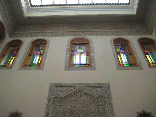
So Fez from the outside, meandering down the streets one would have no idea the difference from one building to the next. There is no demarcation between buildings thus it would be very easy for one to get lost (hence why we followed our excellent tour guides closely). But behind every wall there was a surprise. After gathering information from the reading and then seeing it in person, I was able to fully appreciate the Islamic architectural ideas. This idea that they should not spend time on the exterior, but rather focus on the interior spaces. Then they take this idea philosophically and relate it to their lives. For the Islamic culture, from what I understand, is to better oneself and how they live their lives. Not necessarily praying to the God above, but also being at peace with oneself and not feeling the pressure to live in a certain fashion- but to want to live in that fashion. So they try to better themselves emotionally and personally without paying mind to what they look like on the exterior.

Each inner courtyard is specially decorated to fit with that space. Hand cut tiles, open to the expansive sky above, and beautiful arch ways that lead into annexed spaces these courtyards are what help them to live the lives that they do. Each inner courtyard has its layers of space, created by different edges and walls. And each edge helps to signify something else that means a great deal in their lives. Such as: The edges of the roof tops the frame your view of the sky when looking up from the courtyard. The series of arch ways that lead you possibly into a more scared room or into a different sector or meaning of life. The series of entrances from the road to the center of that courtyard. Each of these ideas are established by the underlying ideas of creating an edge from one idea to the next (one architectural space to the next). In their culture one can not just call a courtyard a courtyard without thinking about what the underlying meaning of the direction it is facing, the tile pattern on the wall, and the colonnaded paths ways leading from the center space. Each element has been placed their for a reason, each idea is apart of their actual lifestyle.


So no longer is a wall just a wall that creates an edge that ultimately creates space- it is a lifestyle, a way to perfection. And because of these ideas, I have since become quite interested in learning more about their culture.


Although no camels, Africa was still a success.